AIC – Arena of Valor International Championship is the ultimate global stage of Arena of Valor (AOV) — where the world’s strongest teams battle for honor, pride, and everlasting glory.More than just a tournament, AIC is a celebration of skill, strategy, and teamwork, where players from around the world showcase their unbreakable passion and relentless pursuit of greatness.Every match tells a story — of rivalry, courage, and dreams coming to life. From iconic plays to emotional victories, AIC captures the very heart of competition and transforms it into moments that last forever.


OVERALL
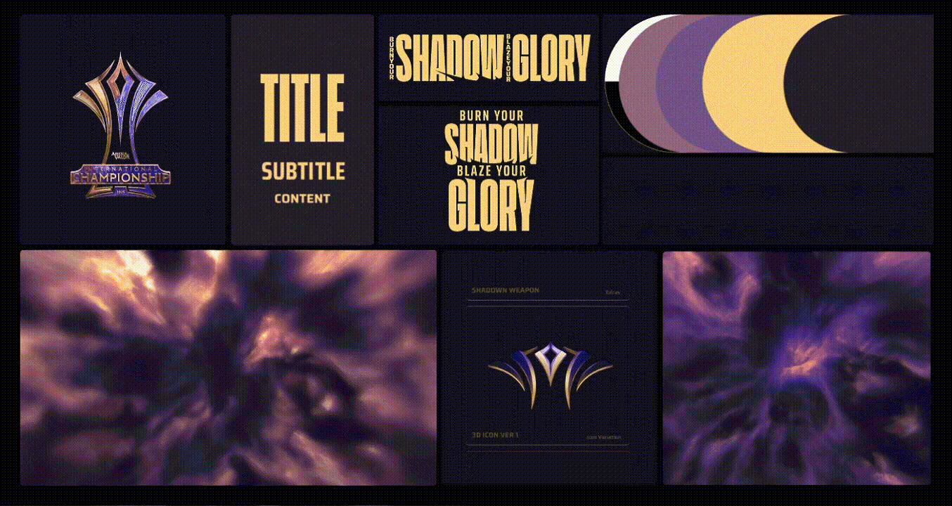
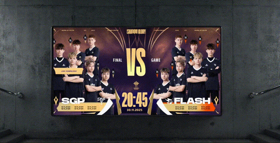
AIC 2025 delivers a high-stakes, high-pressure tournament where mental toughness and adaptability determine the champions. Tied to the Light & Shadow: The War Returns update, it reignites the epic clash of light and darkness in Arena of Valor, blending intense esports action with a captivating storyline.
COLOR SCHEME
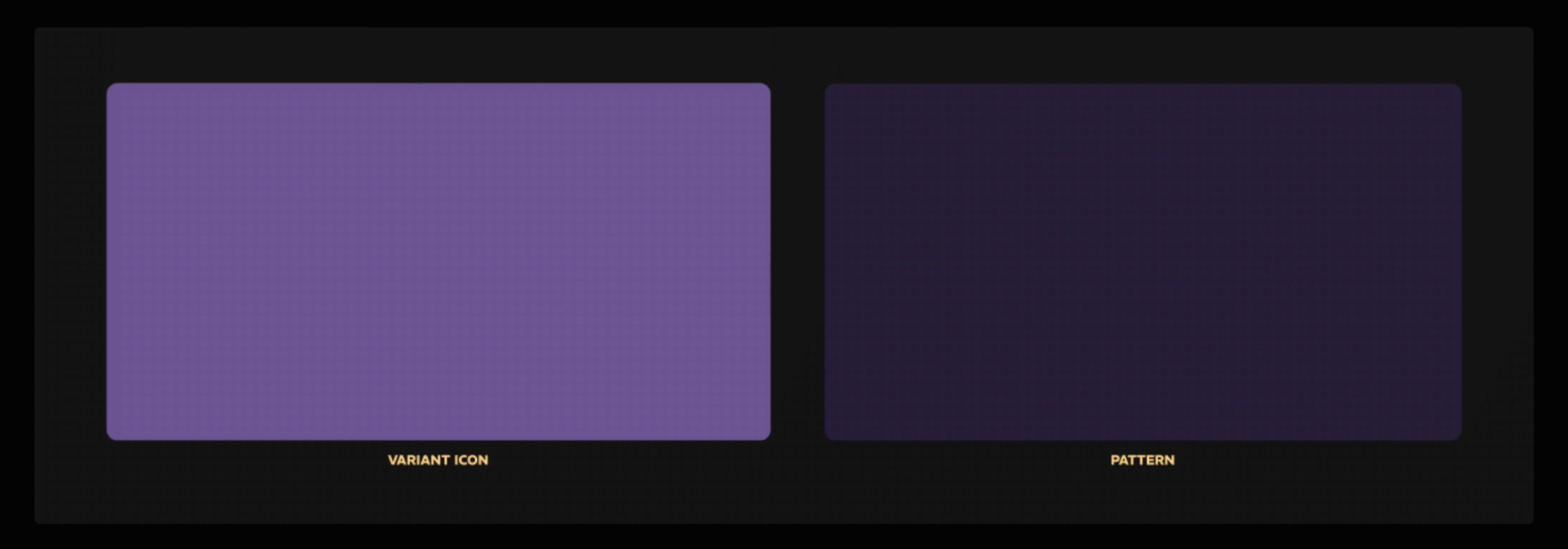
COLOR SCHEME The color scheme reflects the Light vs. Shadow concept of the AIC tournament and aligns with the project’s key visual. Serving as supporting and neutral tones, it ensures balance and harmony across all designs while blending seamlessly with each team’s signature color — FPT Orange, ONE Green, SGP Gold, BSS Gray, and SNV Blue.

FONTS SYSTEM
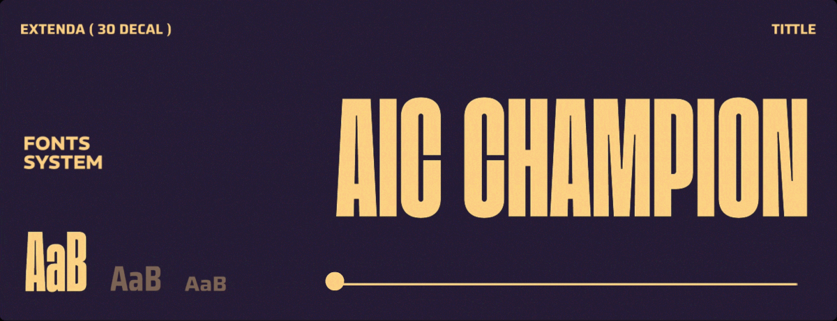
The typography system features the geometric sans-serif Saira, bringing a modern edge to the International Championship. Its clean, well-balanced design and wider spacing ensure clarity and consistency across schedules, player names, and content.


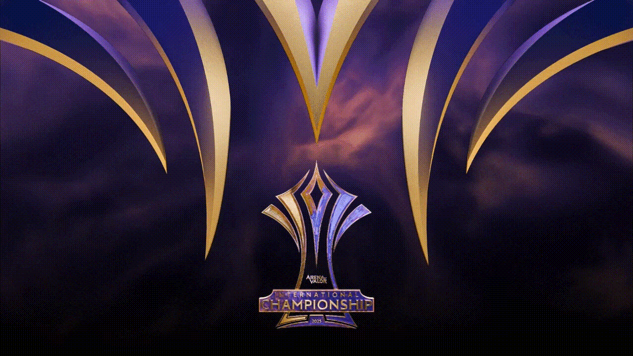
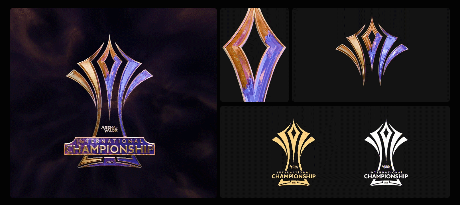
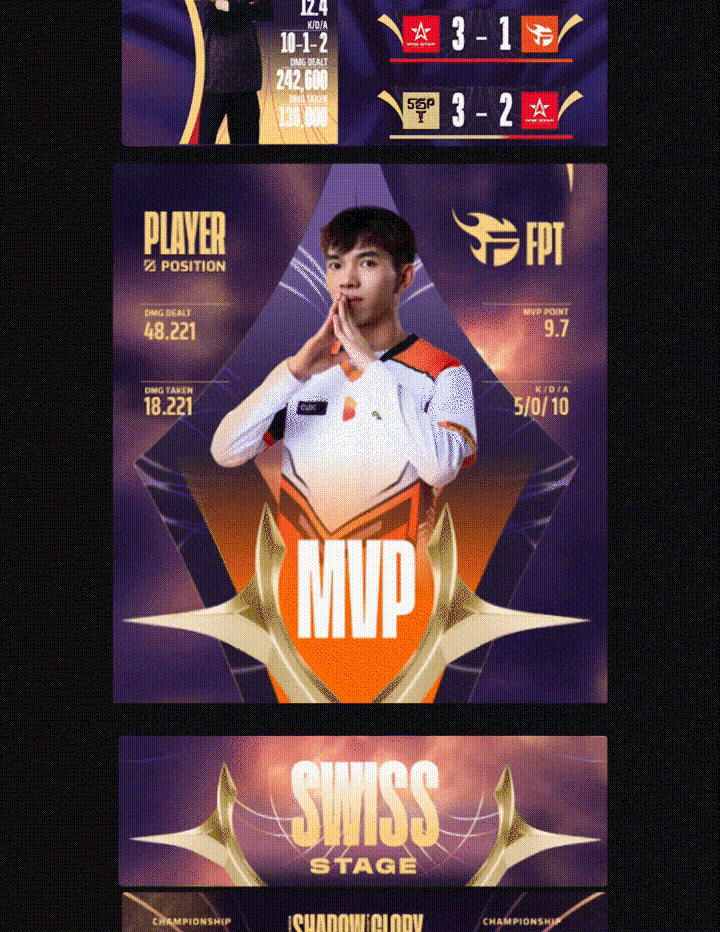
LOGO REVISION
The original 2D logo on the left retains its core design, with color adjustments made to align with the tournament’s visual identity. On the right, the 3D variation is developed to complement the Shadow and Light concept, featuring dark and light accents radiating from both wings.
GRAPHIC ELEMENTS
The concept of key graphic element idea is the integration between tournament logo symbol and cosmic form, such as light contrast, sacred geometry, etc. This integration forms a structured yet fluid visual system, reflecting the duality of shadow and light with overlapping circular forms that add depth and rhythm, radiating energy while anchored to the central icon.

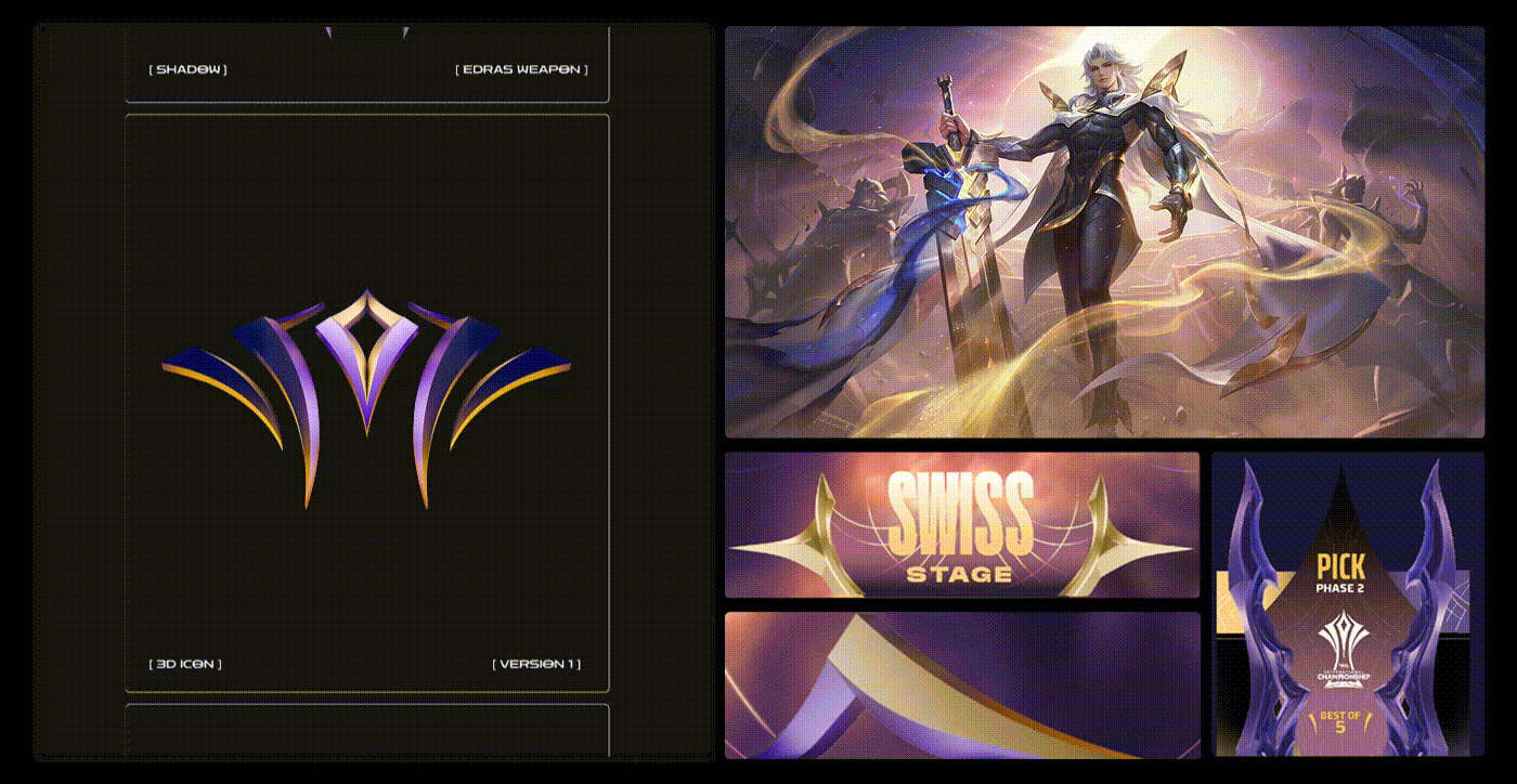
KEY 2D ELEMENTS & PATTERN
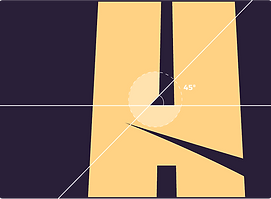
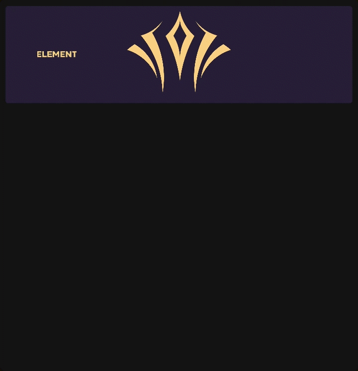
The main symbol is separated into distinct graphic elements to allow flexible use across different contexts while keeping a consistent identity.This system ensures each element contributes to the overall visual language while serving specific purposes in communication. Aside from the concept of the key graphic element idea being centered on cosmic forms, it also draws inspiration from sports identity, particularly resembling the circle line marking of the stadium field.

3D ELEMENTS
The 3D icon enhances the tournament icon with a sense of spectacle and showmanship, making it feel alive and epic. Its glowing, dimensional form creates deeper immersion, connecting closely with in-game aesthetics.
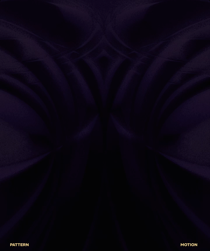
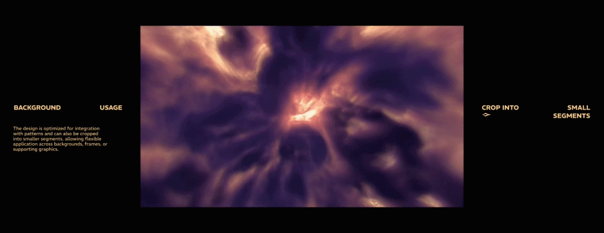
BACKGROUND
The backgrounds features a swirling nebula and interstellar cloud pattern on a rich blue canvas, with the addition of the light shade that enhances contrast between the dark voids and glowing highlights.


Client: Garena
VISUAL IDENTITY BY ZUMMAZ STUDIO
Creative & Art Direction: Khang Giate, Umgj
Account manager: Tony
Typography system: Umgj
Graphic elements system: Giate
Graphic Designer: Lta_Khoa, Umgj
Motion design: Giate, Lta_Khoa
3D & Vfx: Giate, Katasumiii